
Open Enrollment
Client
SuccessFactors is an independent business unit within SAP, the market leader in enterprise application software. SAP SuccessFactors provides a leading cloud-based HCM Suite, which helps HR drive business execution with complete, beautiful, and flexible solutions that start anywhere—optimizing workforces today and preparing them for tomorrow. SAP SuccessFactors has over 6,200 customers, 47 million subscription seats in more than 177 countries, and 37 languages.
Overview
SAP SuccessFactors identified a critical need to enhance the Open Enrollment functionality within their Employee Central Global Benefits solution. The existing system was cumbersome, lacked intuitive features, and failed to provide employees with the necessary support during the benefits selection process.
Open Enrollment Overview
Open Enrollment is a period during which employees can select or change their employer-sponsored benefits, such as health insurance, dental coverage, vision plans, and other perks offered by their organization. It typically occurs once a year and allows employees to review available benefit options, consider any changes in their personal or family situation, and make informed decisions about their coverage for the upcoming year.
Open Enrollment is an essential opportunity for employees to ensure they have the right benefits to meet their needs and preferences, as well as to take advantage of any new offerings or updates to existing plans.
The Problem
While there were many problems with the existing SAP SuccessFactors Open Enrollment offering, we chose to focus our efforts on the following:
-
- Complexity: Employees found the existing enrollment process convoluted and challenging to navigate.
- Limited Transparency: Employees struggled to comprehend the details of benefit plans, resulting in uninformed decisions and potential dissatisfaction.
- Poor Mobile Accessibility: With the rise of remote work, employees demanded a seamless mobile experience for accessing and managing their benefits.
- Inefficient Dependent Selection: Adding dependents was cumbersome, leading to errors and increased administrative burden for employees and HR managers.
The Before State
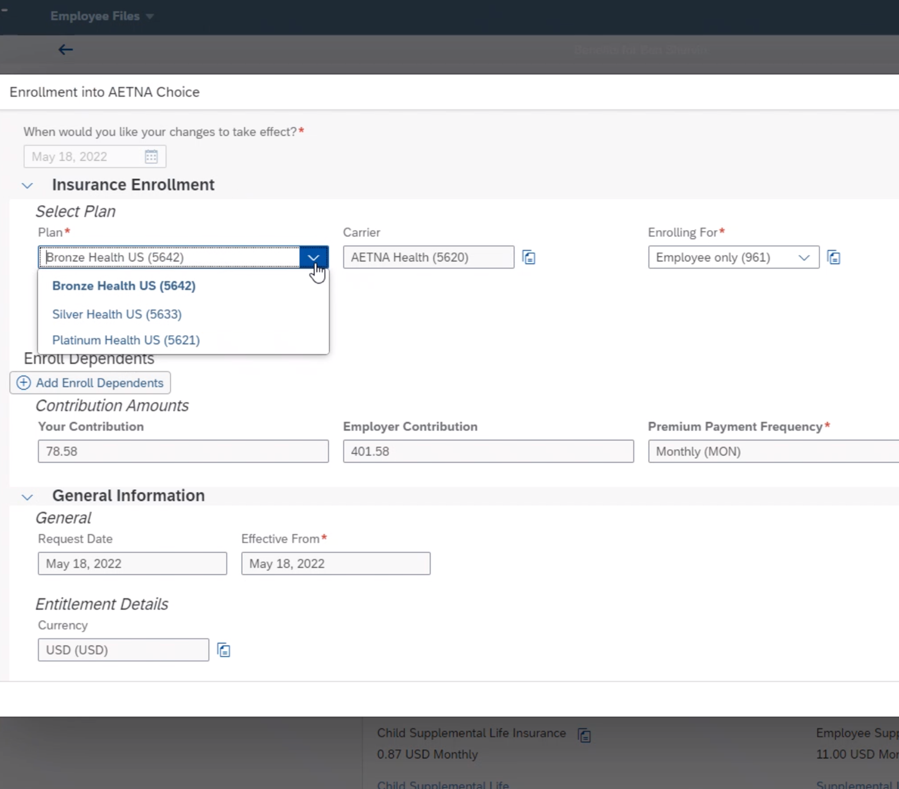
The before state suffered from several usability issues that I defined in a heuristic analysis. The UI was inconsistent since it no longer utilized skinnable code, and ultimately, SAP SuccessFactors was losing sales deals from it, too.
Therefore, leadership requested an overhaul of the module but only had one request from our team—nothing custom, only existing UI components from the SAP UI pattern library.
Being relatively new to the Benefits team, I took it upon myself to examine the existing product first to figure out exactly what was working and what was not.I walked through the flow without any help or guidance so I could get my own unbiased opinion of the system’s current state. Once I had an idea of the flow and the overall concept, I was ready to start the tried-and-true user-centered design process.
The Process
The Open Enrollment project followed the five-stage design process proposed by the Hasso-Plattner Institute of Design at Stanford (d.school), which is very similar to the user-centered design process. It includes the following stages:
Empathize
Actual users were involved in the design process from the beginning in the form of focus groups and one-on-one interviews. Critical design decisions were evaluated based on how features and design elements worked for users.
Define
Requirements were critical as I began to create a conceptual design and, ultimately, the Minimum Viable Product (MVP). The product team and I aligned business requirements with users’ needs to ensure customers would adopt our product.
Ideate
Using a biweekly call with our Design Advisory Group, composed of several top clients, we introduced a user feedback loop in the product life cycle. We met regularly to discuss ideas and concepts and review early mockups. This information helped us make more user-focused decisions.
Prototype
I created a preliminary version of an open enrollment desktop in Figma to explore and test its functionality, design, and overall user experience before full development.
Test
I consistently worked on improving the user experience throughout the project. With the support of the SAP central research team, I conducted several A/B tests and general usability studies to further refine the interactions, layouts, and page contents.

Initial Low Fidelity Flow Diagram
Discovery
As part of the Empathize phase, I talked with several customers, including stakeholders and actual end-users of our existing system. I tried my best not to come up with solutions immediately but rather listen and keep an open mind to possibilities.
During the discussions, some users already had a laundry list of solutions, but when that happened, I tried to bring the conversation back to why they wanted something to understand the root issues that the users were facing instead of just gathering a list of wants and nice-to-haves.
To my surprise, many users were very passionate about the Open Enrollment process, which was great but actually a little unexpected.
Team Composition & My Role
The Open Enrollment team was comprised of three program managers, twelve developers across three scrum teams, and myself. I was the only product designer on this module and acted as an information architect, visual designer, accessibility expert, and interaction designer.
I created the research and usability test scripts for the formal usability tests, but the central research team executed the tests.
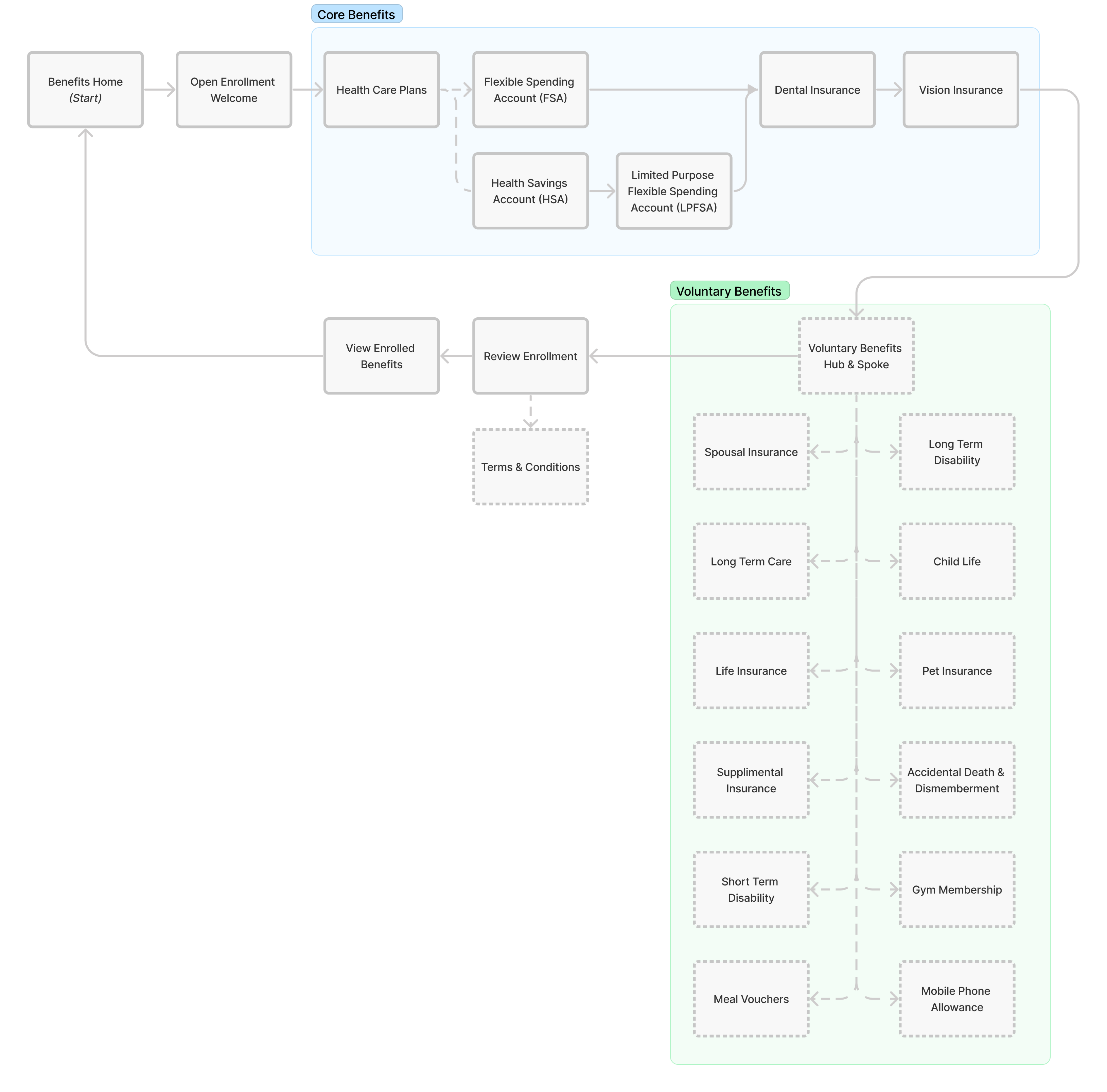
Site Map
The Structure
Before creating any mockups or prototypes, I wanted to ensure that the application flow was correct. Being relatively new to the Benefits team, I worked with the Product Managers and seasoned Engineering Leads to help clarify our goals before I started designing a single pixel.
As a team, we reviewed and updated the personas for this module, decided what we wanted from the redesign, and whiteboarding out critical user paths to ensure that every part of the open enrollment process reinforced our goals and requirements.
Solution Overview
Project Objective
The goals I set forward for myself and the overall experience while reimagining the Open Enrollment module were simple:
-
- Make it intuitively simple to use.
- Empower employees to make the most intelligent decisions for themselves and their families.
- Carry forward as much existing data from the previous year as possible.
- Use clear language and avoid industry jargon to ensure users can quickly understand their benefits.
After gathering buy-in and consensus with the Product Management and Engineering teams, they were 100% behind those goals, but I added one more for the user experience:
-
- A goal of sub-1-second page load times.
Key Features of the Redesign
-
-
- Personalization: Deliver a tailored enrollment experience for each employee, presenting relevant benefits based on their location, role, and life events.
- Guided Enrollment: A step-by-step guided enrollment process ensuring employees never lose track of their progress, with real-time eligibility updates and clear instructions at each stage.
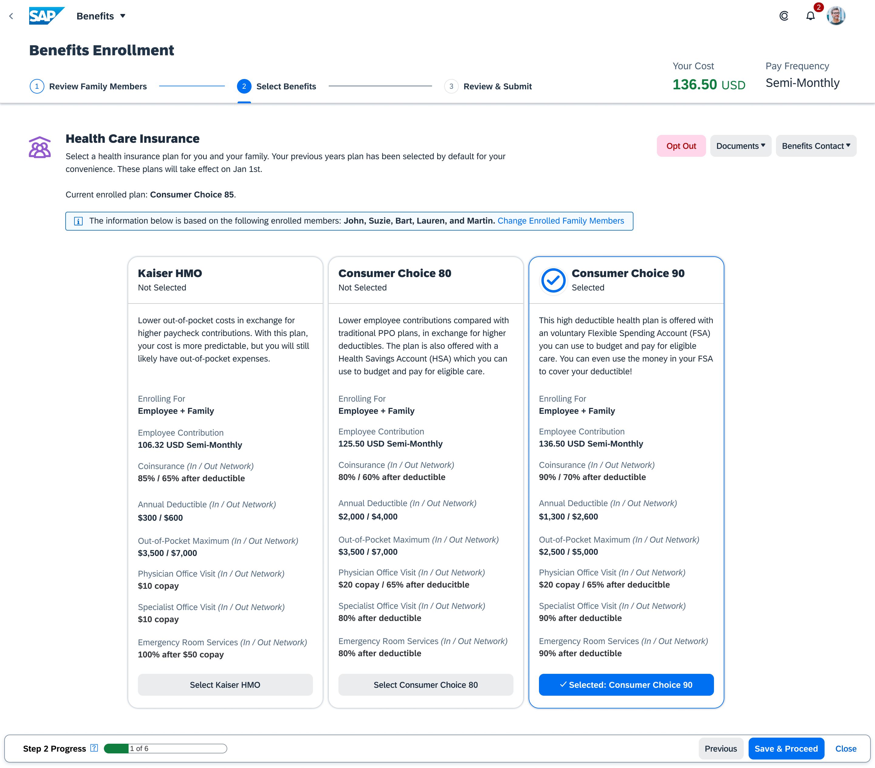
- Transparency: A side-by-side benefit plan comparison enabling employees to make informed decisions by visualizing differences in coverage, costs, and other important factors.
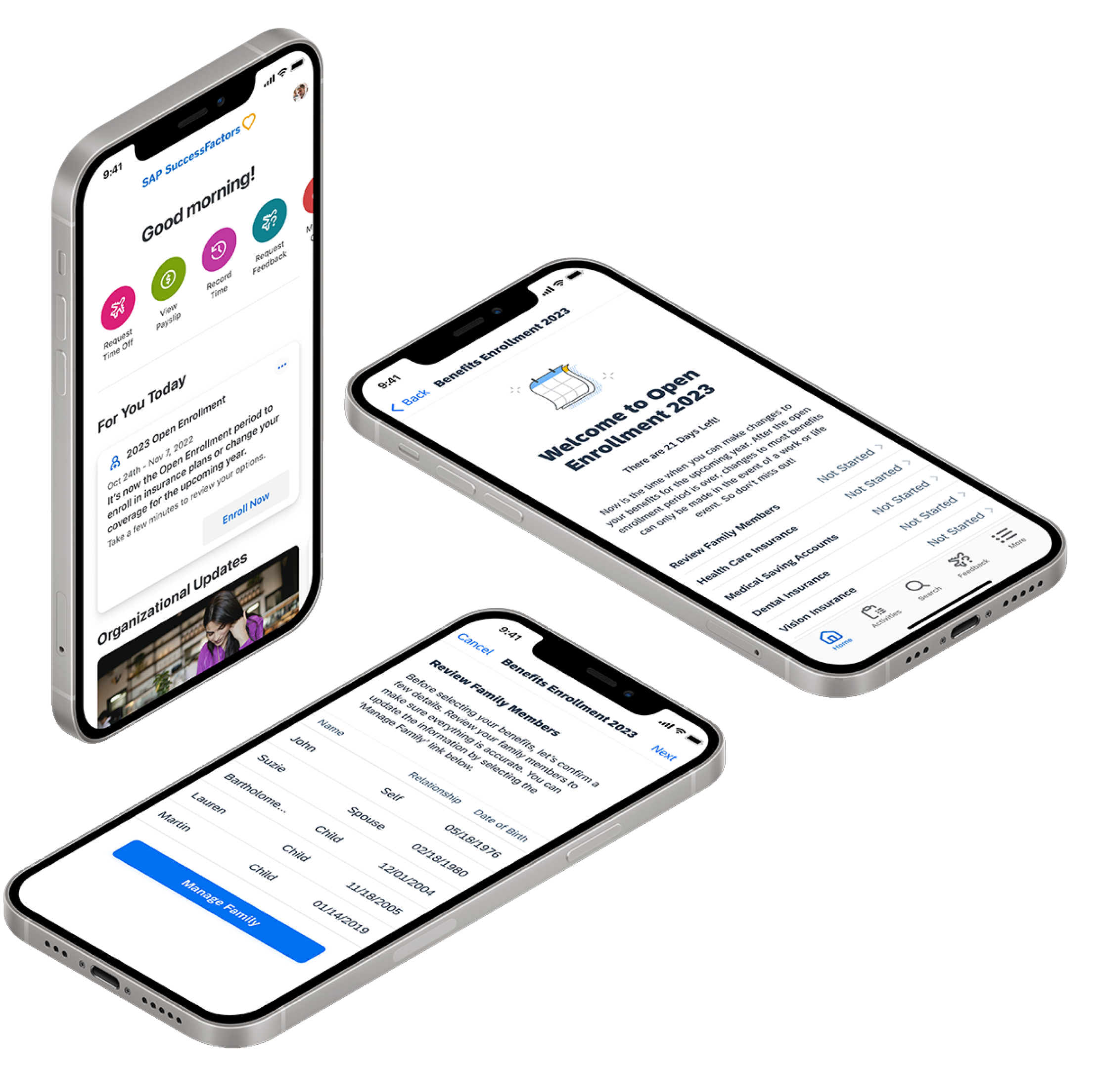
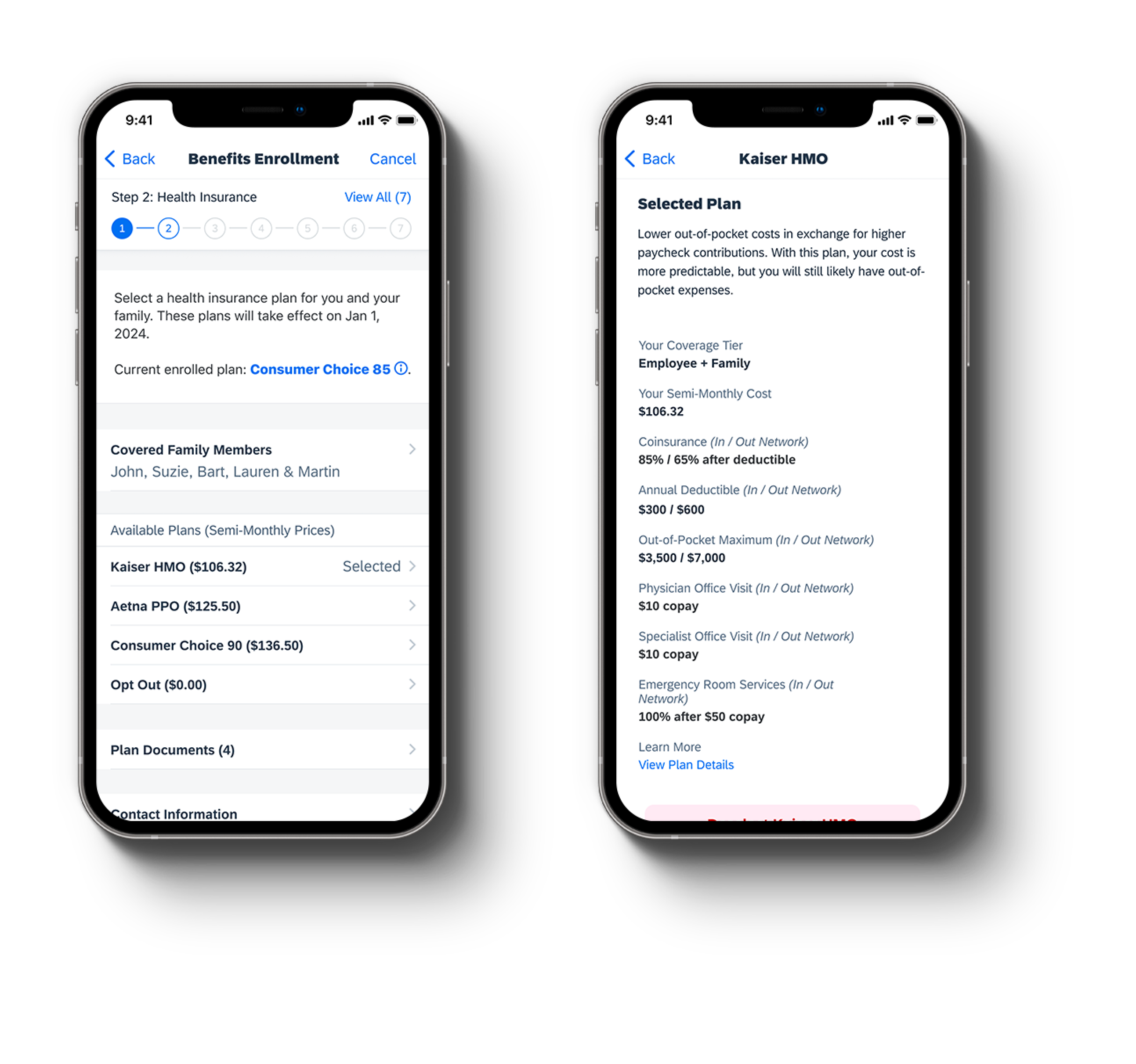
- Mobile Accessibility: The redesigned platform is fully mobile-enabled, allowing employees to complete their enrollment from any location using the SAP SuccessFactors mobile application.
- Streamlined Dependent Selection: Adding dependents is now a seamless process, reducing errors and administrative overhead for both employees and HR managers.
-
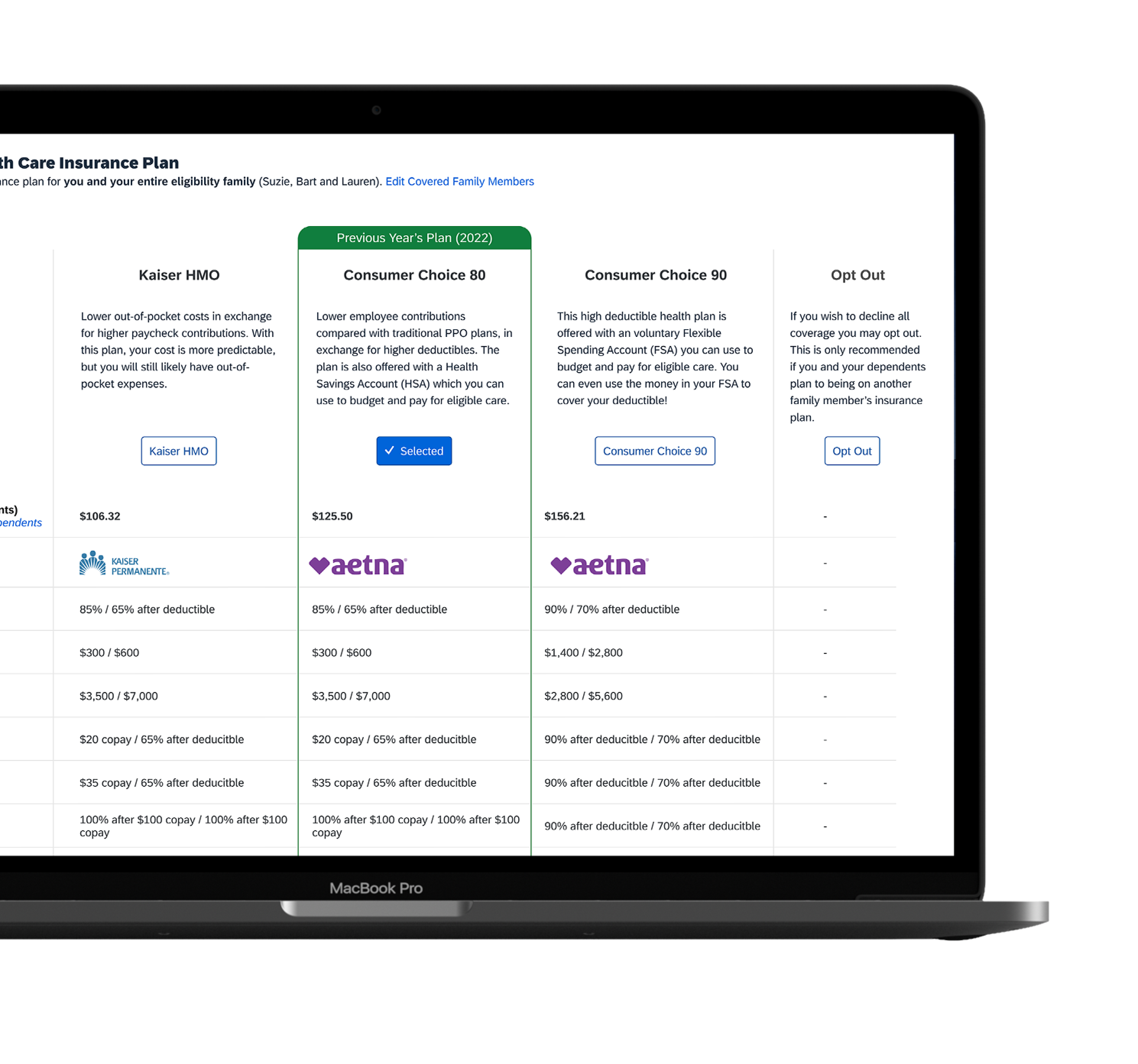
Conceptual Design w/ Tables Instead of Cards (Desktop)
Target Users
Human Resources (HR) Managers/Administrators: They manage employee benefits within the organization. They configure and administer various benefit plans, such as health insurance, retirement plans, and flexible spending accounts.
Employees: These would be the most significant user group, and we enabled them to select, modify, or waive their benefits during the designated enrollment period. They also can review plan details, compare options, and make informed decisions about their benefits package.
Benefits Administrators: Oversee the enrollment process, troubleshoot issues, and support employees who may have questions or require assistance with their benefit selections.
Managers/Supervisors: Review and approve benefit selections made by their team members. This access enables them to ensure that their team members have completed the enrollment process accurately and in accordance with company policies.
Finance Department: This department ensures accurate payroll deductions for employee benefits and reconciles benefit expenses with the company’s financial records.
Not Mobile First
I reached out to our internal analytics team early on in the project to gather various data points about the existing Open Enrollment module and parent module, Benefits.
To my surprise I discovered only 6% of the Benefits module traffic coming from our native mobile app and 94% from the desktop. With such a firm population using the desktop site I decided to start with the responsive desktop designs and then ultimately scale down to a native mobile iOS experience second.
The Outcome
The redesigned Open Enrollment experience revolutionized how customers interacted with SAP SuccessFactors’ Employee Central Global Benefits solution. With its intuitive design, personalized features, and enhanced transparency, the new platform empowered employees like never before, resulting in higher engagement, improved decision-making, and greater satisfaction with their benefits package. Furthermore, HR managers experienced reduced administrative burden and increased efficiency in managing the enrollment process for their organizations.
By employing a user-centered design approach, we successfully addressed the diverse needs of its user base. It delivered a solution that met and exceeded expectations, ultimately driving value for employers and employees.
Various Native iOS Open Enrollment Mobile Screens
Ongoing Product Evolution
While the first iteration of this reimagined product has been delivered, I always strive to improve it by digging into analytics. By delving deeper into analytics insights, I’m able to uncover valuable data-driven perspectives that inform iterative refinements. This ensures the product evolves in alignment with user needs and preferences, ultimately fostering a more seamless and satisfying user experience.
Analytics
I collaborated with our analytics team to ensure we implemented an analytics tracking tool to monitor user behavior, such as which customers implemented our new product, where users dropped off in the enrollment process, and how long it took to complete the process.
User Testing
I regularly conducted quarterly user testing to gather feedback on a product’s design and functionality. This helped identify pain points and areas for improvement.
Feedback
I also regularly analyzed feedback from our external-facing customer community website to identify common themes or issues, and prioritized enhancements based on user needs.
Roadmap
The original roadmap was used to get us to the initial release. However, occasional updates were needed to ensure the incorporation of site analytics and feedback analysis and that improvements were made strategically and organized.
Changes
I worked with our Quality Assurance (QA) team to help communicate changes to customers and provide clear instructions on how to use new features or settings.
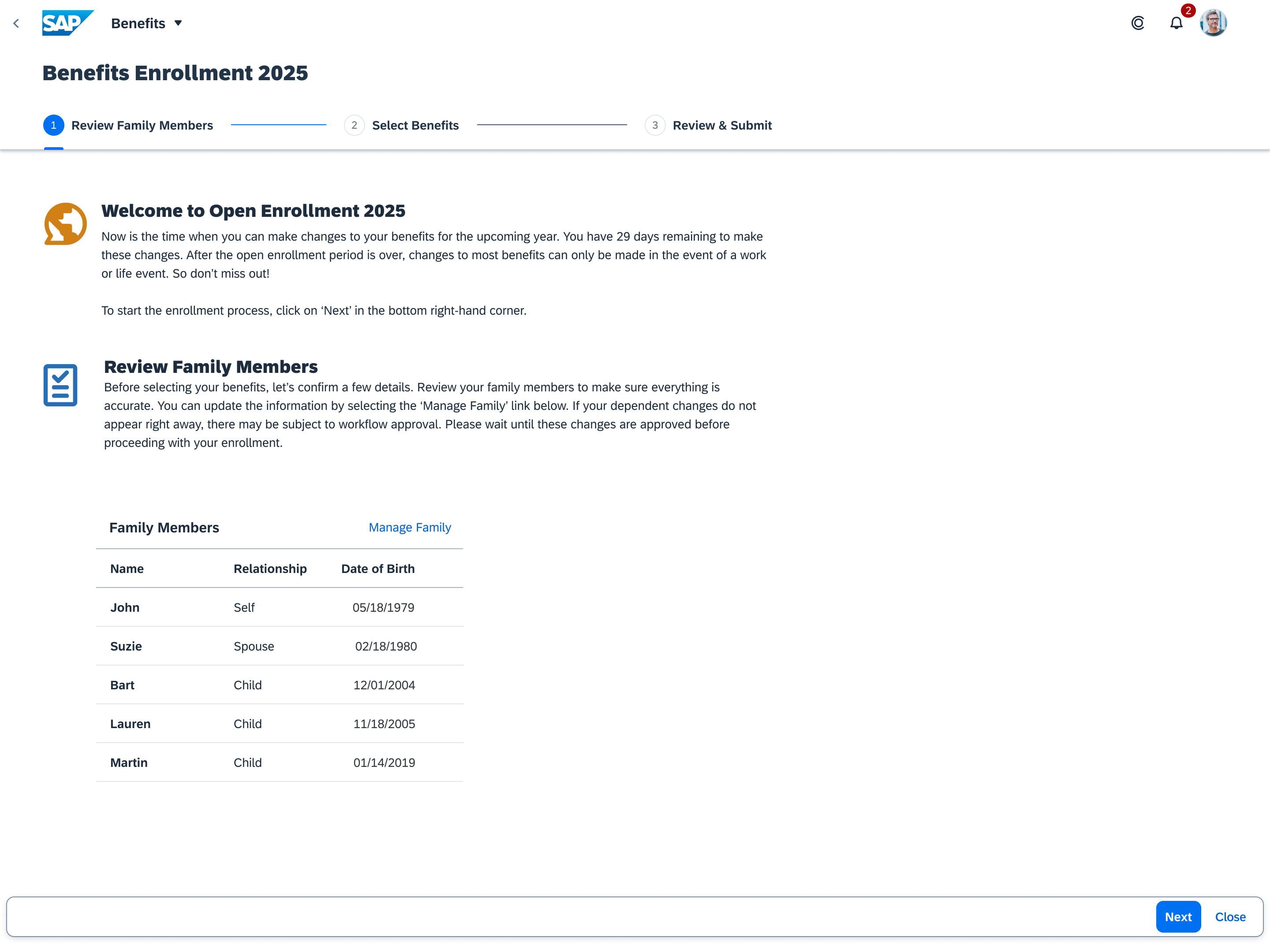
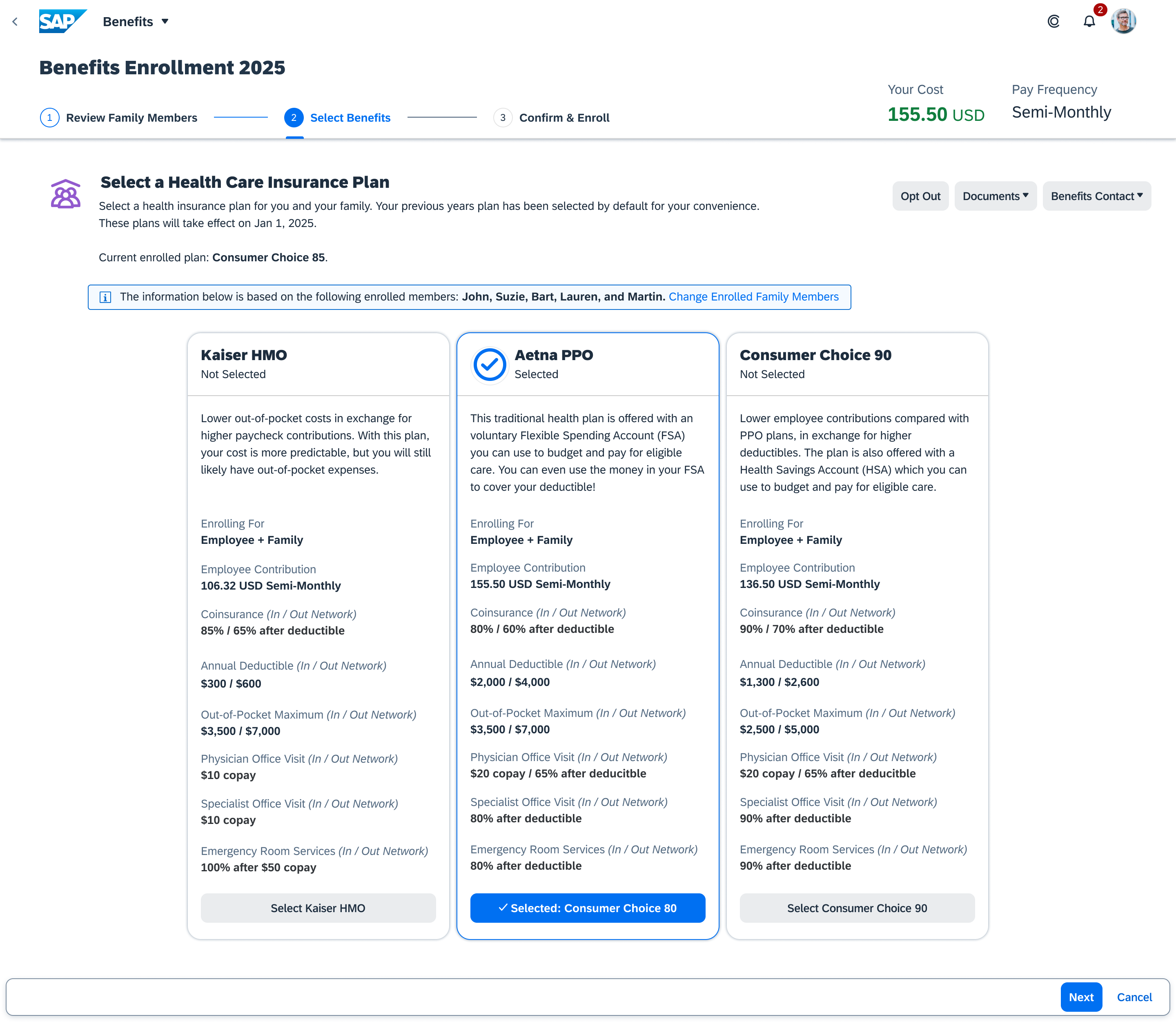
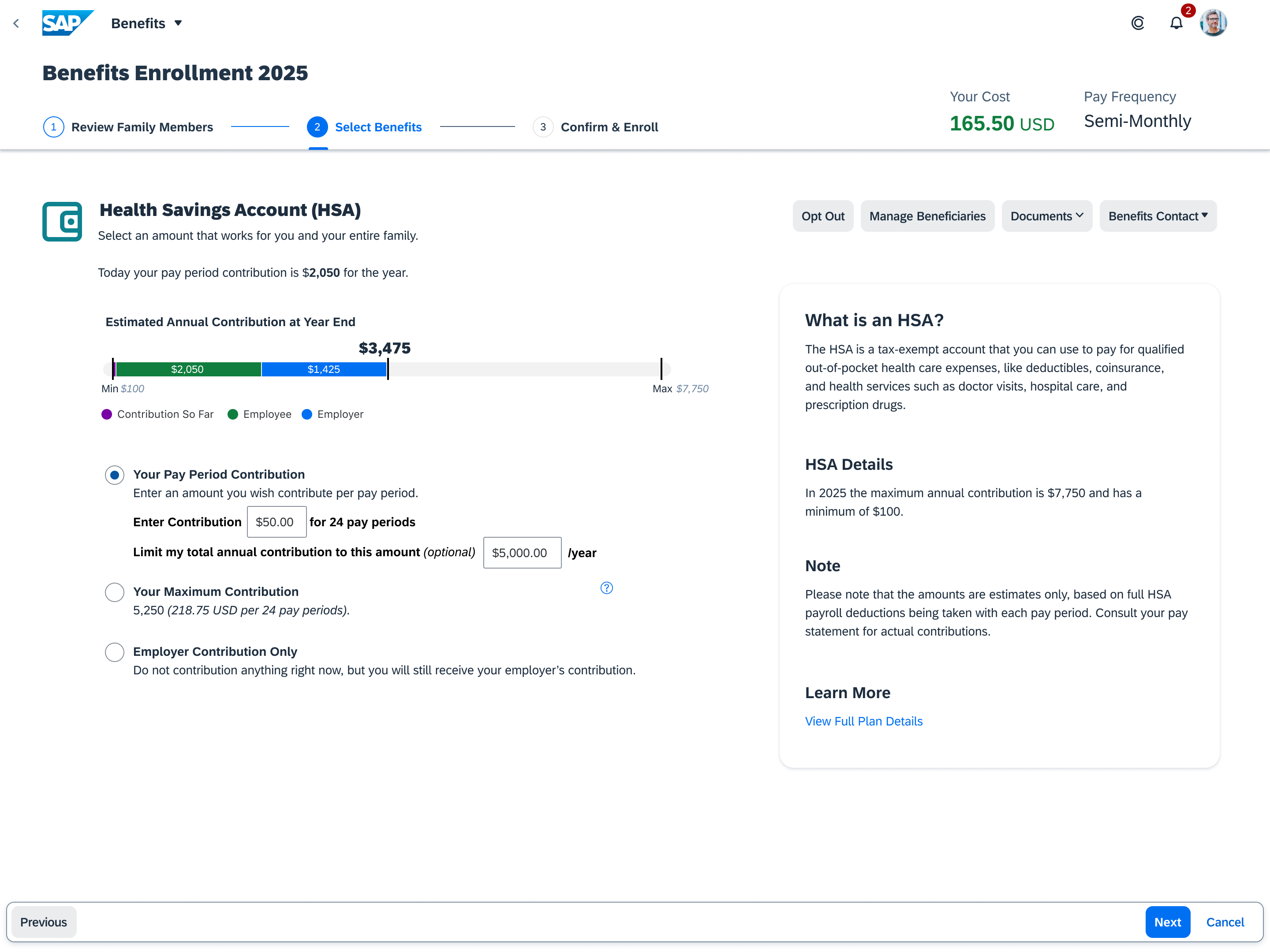
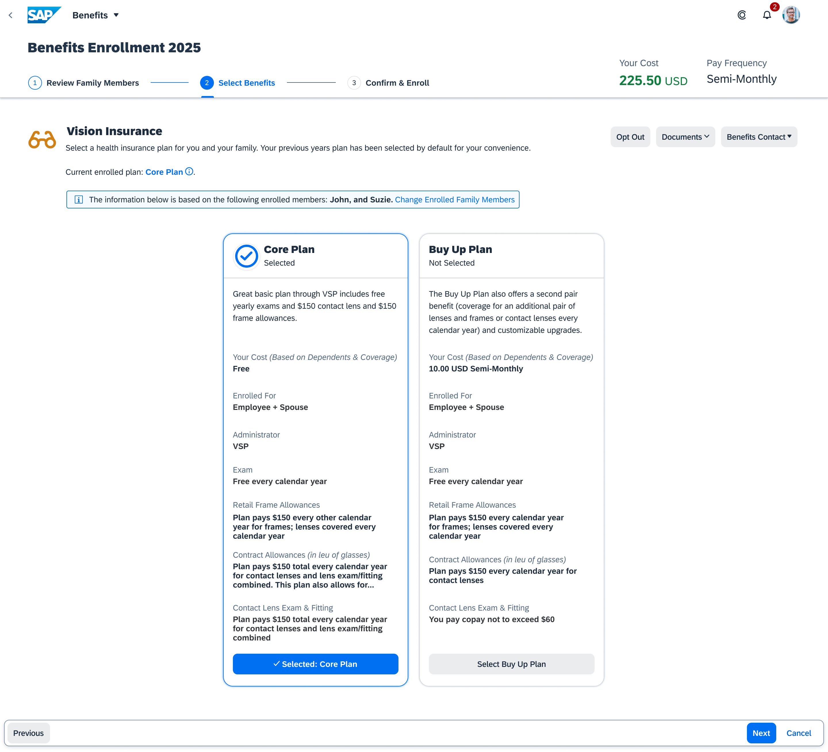
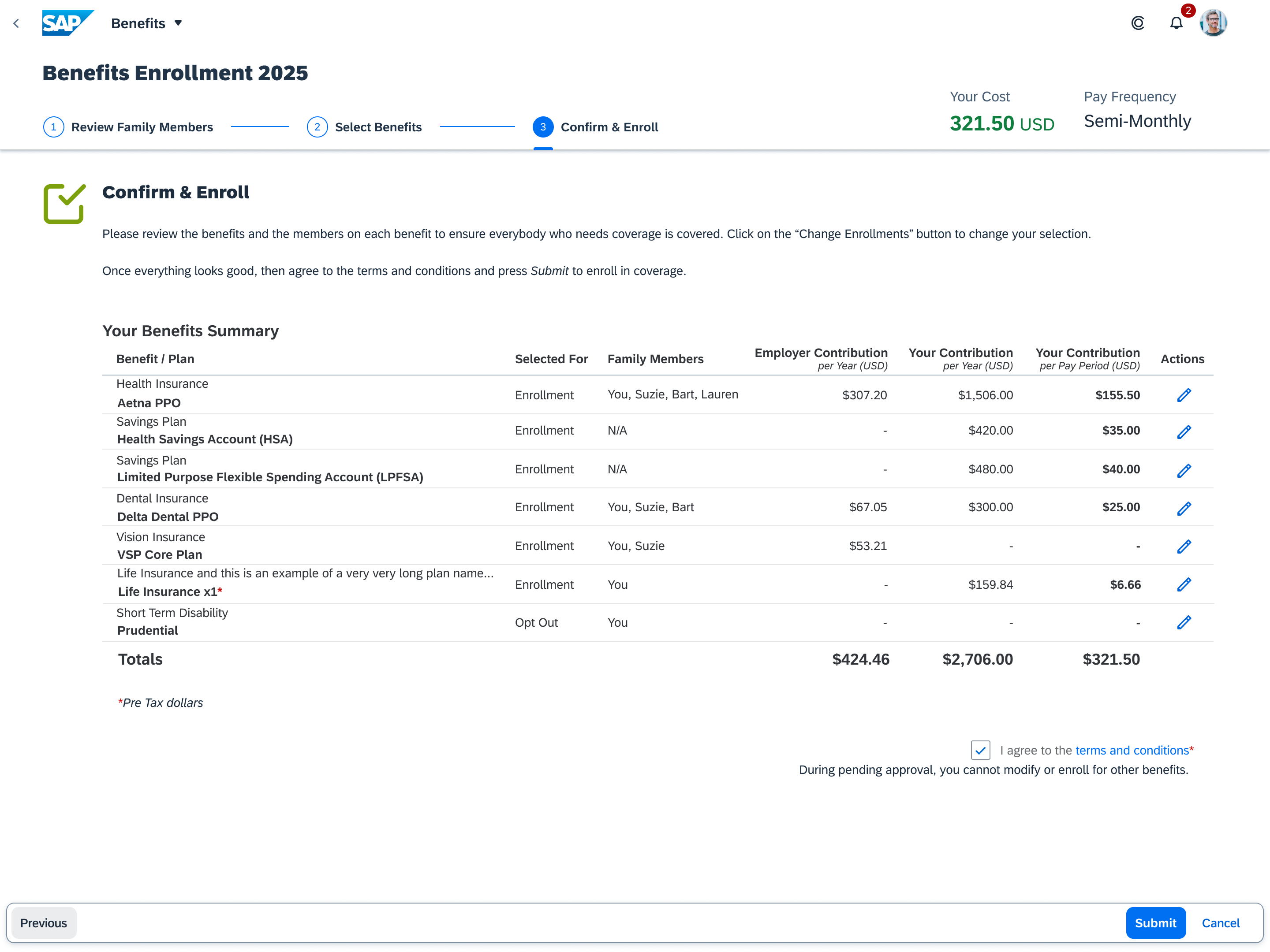
Final Open Enrollment Screens (Desktop)


